
/f/131443/716x454/1ca638056c/full-year-tsm-benchmarking-2025-26-feature.png)
/f/131443/927x596/3db997d70d/essentials-customer-satisfaction-measurement-guide-feature.png)
/f/131443/761x484/8a1fd07041/index-cs-q2-2026-feature.png)
/f/131443/1962x1135/e8f74f1bf6/customer-research-review.png)
/f/131443/2367x1553/a6f128f592/how-to-make-jitter-plots-in-excel.png)
How To Make Jitter Plots In Excel
A Jitter Plot is a type of data visualization used to dsiplay the distribution of a set of numerical data points. It is particularly useful when you have a small dataset and want to visualize the distribution of values.
This guide gives you an introduction to Jitter Plots, why you should use them, and how to make them in Excel.
You can download a PDF copy of the guide here.
What is jitter, and why should you use it?
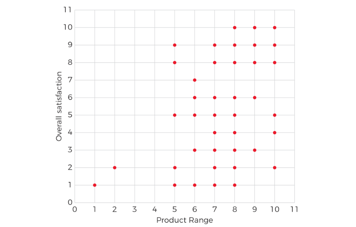
Some charts are difficult to read because their values overlap. This happens a lot when you’re working with survey data that uses a pseudo-interval scale such as the numerical scale of 1-10 or 0-10.
Look at this plot showing the relationship between satisfaction with product range and overall satisfaction. There’s no distinction between the points where there’s just one customer, and those where lots of customers have given the same pair of scores.

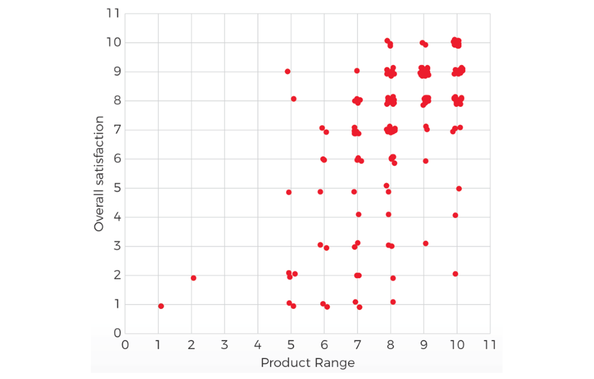
By “jittering” the plot, in other words by adding a small random variation to where each point is plotted, we can make the chart much easier to read and more informative:
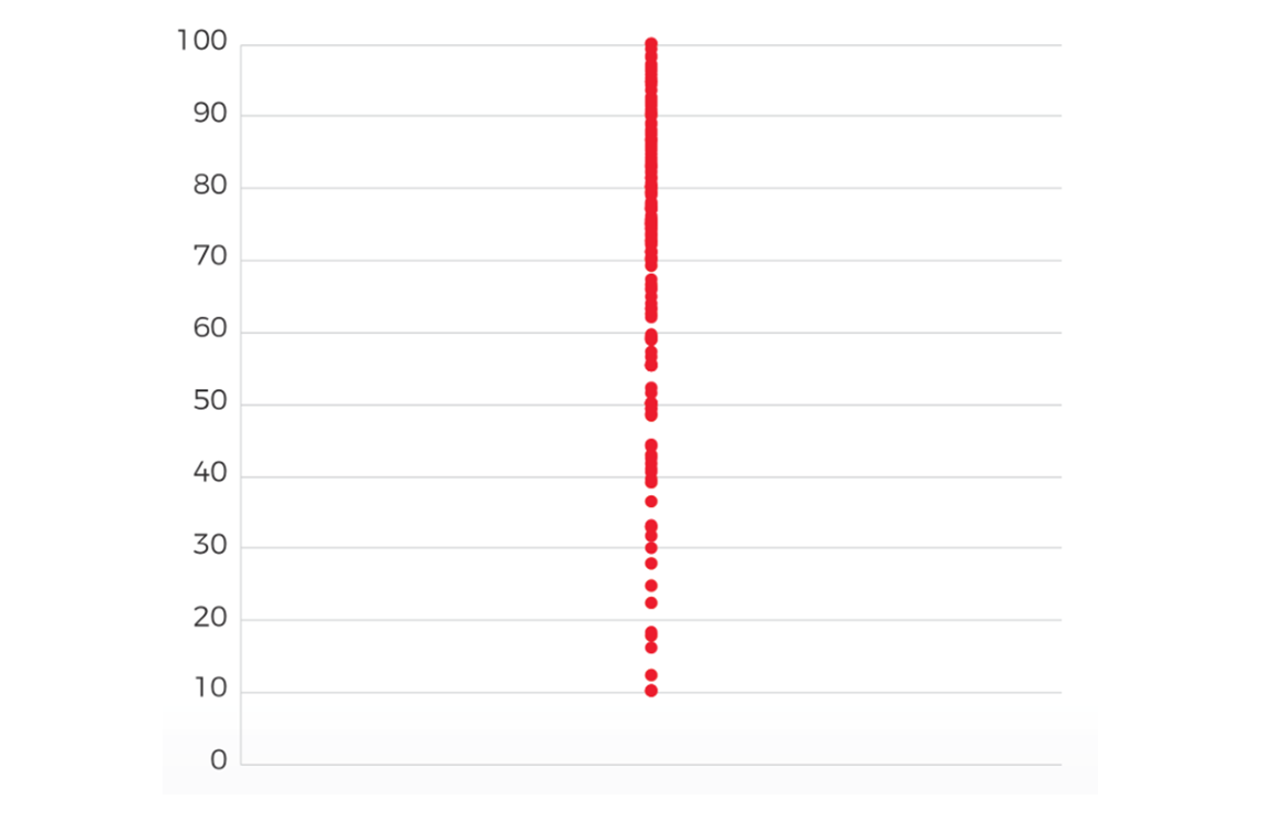
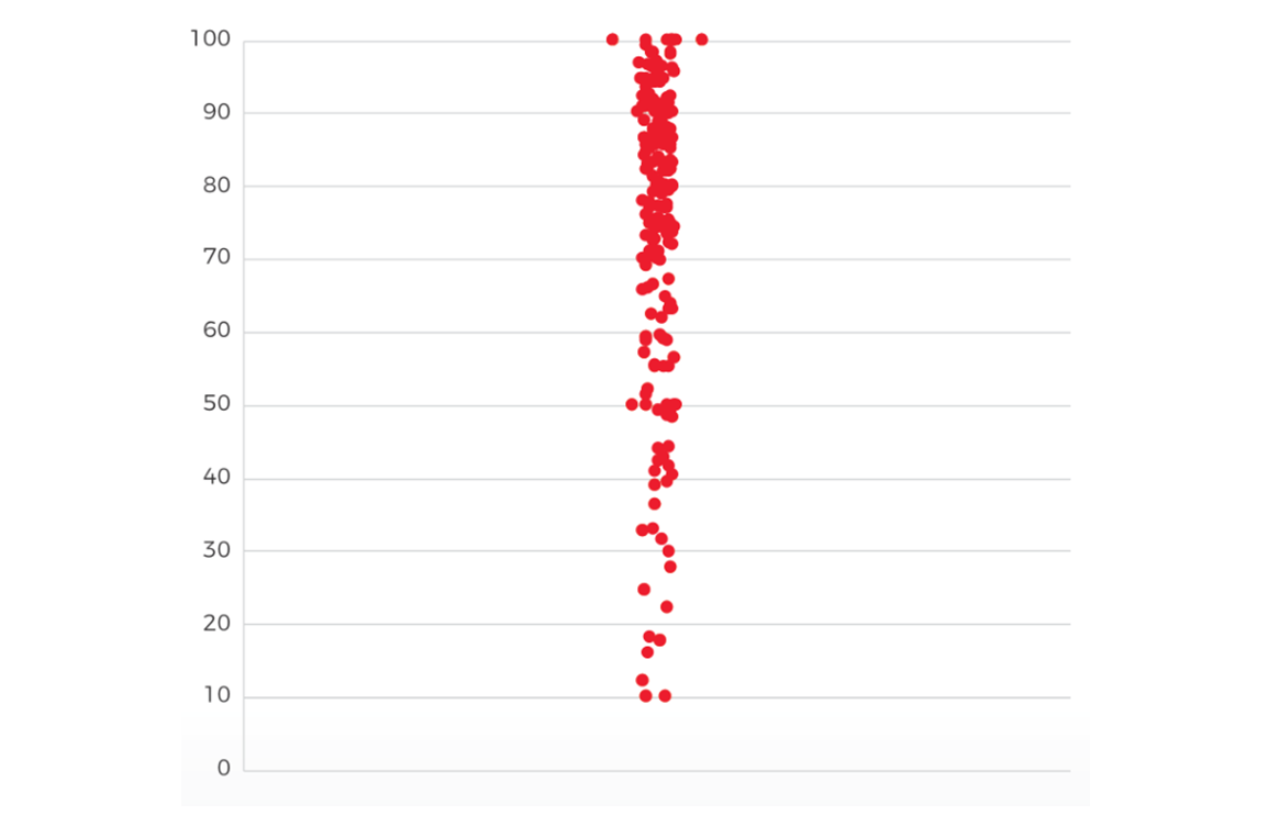
Jitter can also be useful when you want to understand the distribution of a single variable, such as the Customer Satisfaction Index (CSI). We can plot all the responses as a dot plot, but even with a continuous variable there is a great deal of overlap:
We can add some random jitter to spread out the dots and make the pattern easier to see:
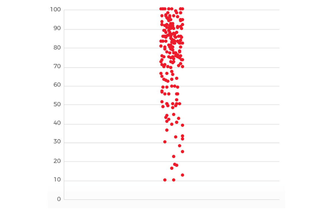
Even better, we can make the amount of spread proportional to the number of nearby dots, so the shape of the plot reflects the distribution of scores:
HOW TO ADD JITTER TO EXCEL CHARTS
Adding jitter to your charts is easy.
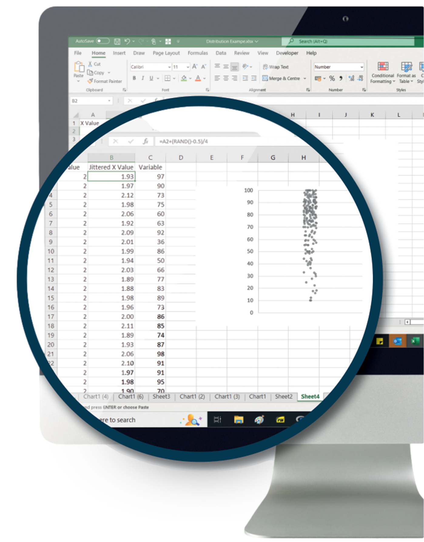
=RAND()
The built in RAND() function generates a random number between 0 and 1, so we use that as our basis.
+(RAND()-0.5)
Adding RAND() to each value we want to jitter will move it randomly, but also add a positive bias - on average each dot will be shifted 0.5 to the right. We can offset that by subtracting 0.5:
+(RAND()-0.5)/4
That works, but it tends to give a spread that is too wide. We can control the spread by dividing the amount to jitter by a constant, Something in the region 3-5 often works well:
Here’s how that looks:
Summary
Excel’s RAND() function makes it easy to jitter the points of a scatter or dot plot so that you can visualise your data more effectively. A few little tweaks to the formula can help make sure your charts are effective and easy to read.
Want to Know More?
Send us a message if you would like to learn more about analysis techniques in customer research.
More from the CX Insights Hub
Downloads
/f/131443/1113x1113/f0c6f0ec13/finding-the-right-statistical-tool-guide-thumbnail.png)
Finding the right statistical tool for you
Description not available
Webinar
/f/131443/509x509/c4be75a338/driver-analysis-final-thumbnail.png)
Driver Analysis
Key driver analysis is the tool which lets you measure which aspect of the customer experience to prioritise, but many organisations are using statistical techniques which are not really fit for purpose. In this webinar we discuss the weaknesses of commonly used techniques, and s...
News & Opinion
/f/131443/1134x1134/2c05cc94dc/stats500.png)
5 Things You Need to Know About Sampling and Statistics
Whether you like it or not, if you're doing research with customers or staff you are relying on the methods of sampling and statistics. These can be pretty scary topics, but we think there's no reason why everyone shouldn't be able to understand the basics. In this post we're go...
Webinar
/f/131443/500x500/db7c90648a/understanding-statistical-significance-webinar-thumbnail.jpg)
Understand Statistical Significance And Confidence Intervals
Statistical significance can seem like a complicated and arcane world, but it’s vital to understand the basics if you want to make decisions with data. We’ll cover what you can and can’t do with survey data, why confidence intervals may make more sense than significance testing, ...